.png)
With over 2,000 clients spanning every state and most industries, ClearCompany has a unique view into when, where, and what types of employees companies are hiring. As we move into what appears to be a new phase of the response to SARS-COV-2, business leaders are looking for sources of good data to guide their decisions. In this post, I’ll share several charts that paint a high-level picture of the change in hiring activity, trends in remote work, and some comparisons to the 2008-9 Financial Crisis.
About ClearCompany and Our Customers
Originally founded in Boston in 2004, we provide human capital management software used by companies to recruit, onboard, engage, develop, and provide analytics on their most vital resource: their people. Our customers are primarily headquartered in North America and typically employ anywhere from a few hundred to several thousand people, with no major industry accounting for more than 10% of our revenue.
Named to the Deloitte Technology Fast 500 in 2019 and #1899 on the 2019 Inc. 5000 list of the fastest-growing private companies in the US, ClearCompany continues to be led by its co-founders, including CEO Andre Lavoie and President Colin Kingsbury.
What does the hiring landscape look like now? @ClearCompany co-founder @ckclearco lays out #HiringTrends during the time of #Covid19The Great Migration Begins
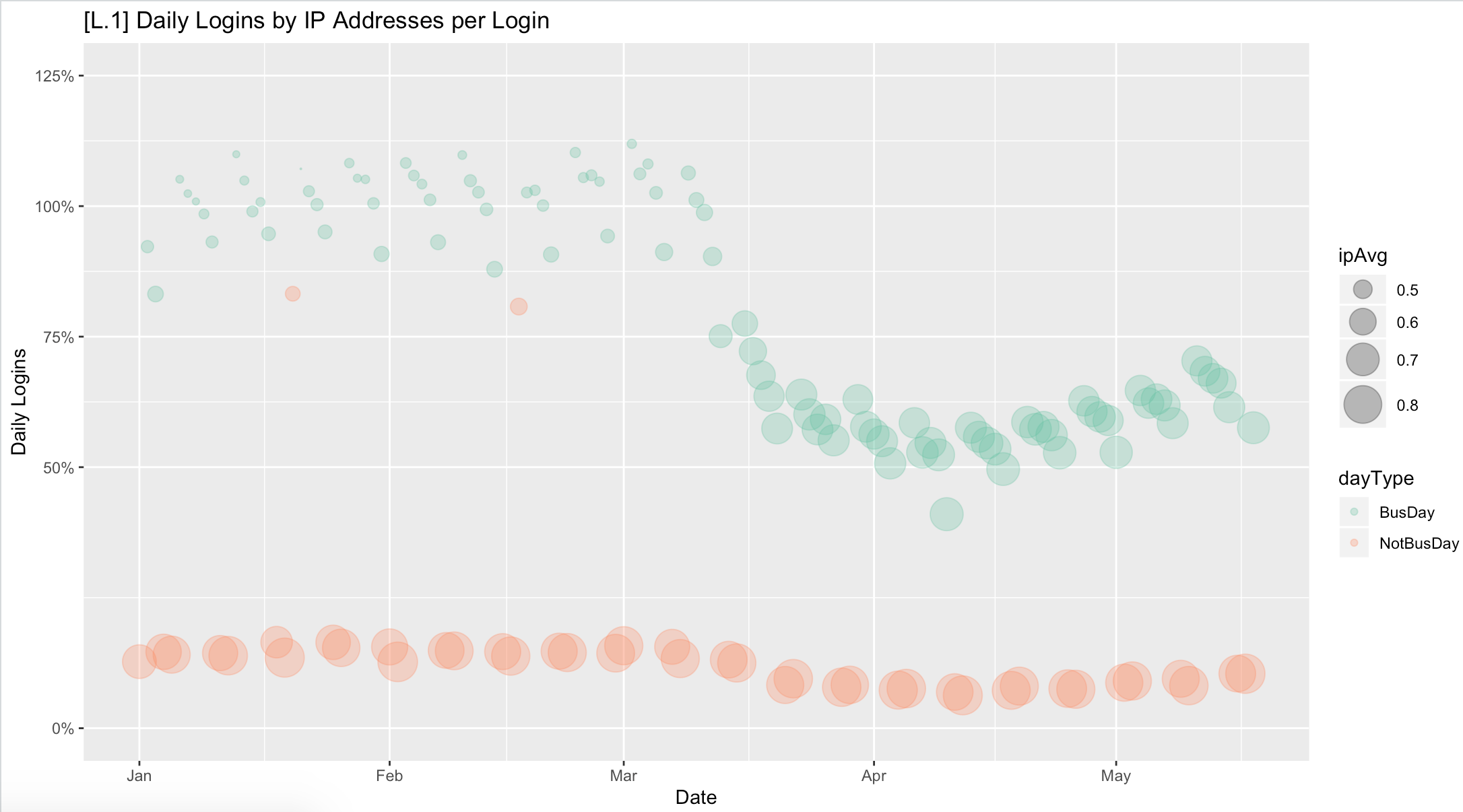
The first chart looks at daily logins by users of our system, which gives insight into who’s working and where. This chart shows three data points: the vertical axis represents the percent of normal weekday usage, and the bubble size shows an approximation of how many people are accessing the system outside the office. The bubble color shows weekdays (green) versus non-working days (orange sherbet).
On this chart, we see a very steady trend in daily usage right up to early-mid March, when the volume goes down and the bubbles start to grow, indicating more users accessing us remotely (compare the green weekday bubbles to the orange weekend bubbles). By the start of April we plateau at about 55% of normal usage and then in mid-Month, start to grow slowly from there. This suggests an increase in hiring activity which is backed up by other data, while the work-from-home trend appears steady so far.
Job Postings
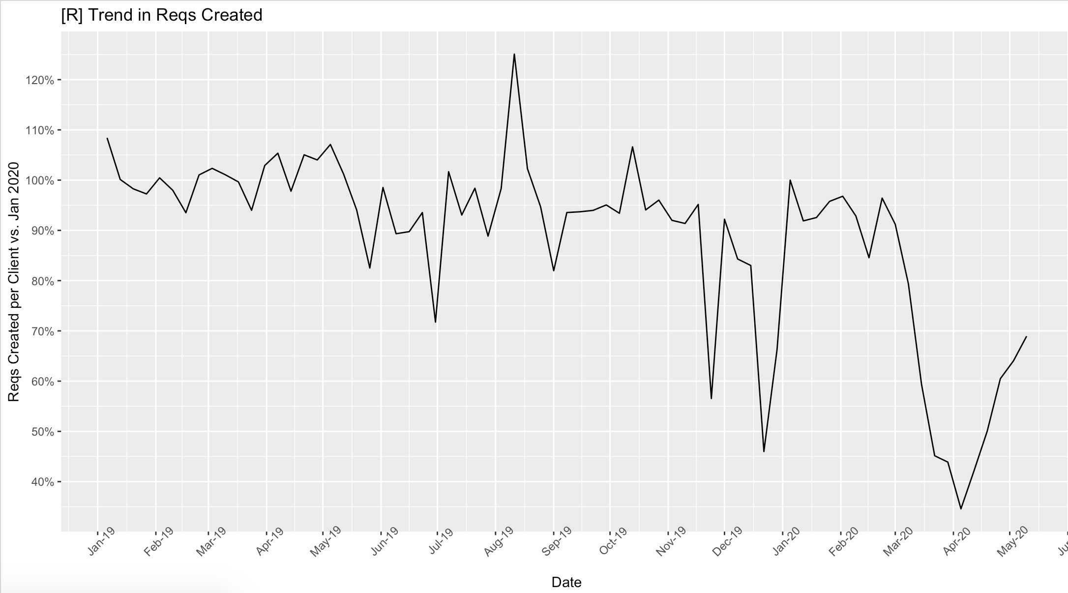
When companies want to hire employees, they start by creating a requisition in our system. Thus, the number of new reqs created over time gives us a sense of whether companies are hiring more or less actively. The chart below looks at the number of reqs created each week going back to the start of 2019, and we can see some spikes up and down around major holidays, followed by a breathtaking drop in March, and then an equally-sharp rise back from early April.
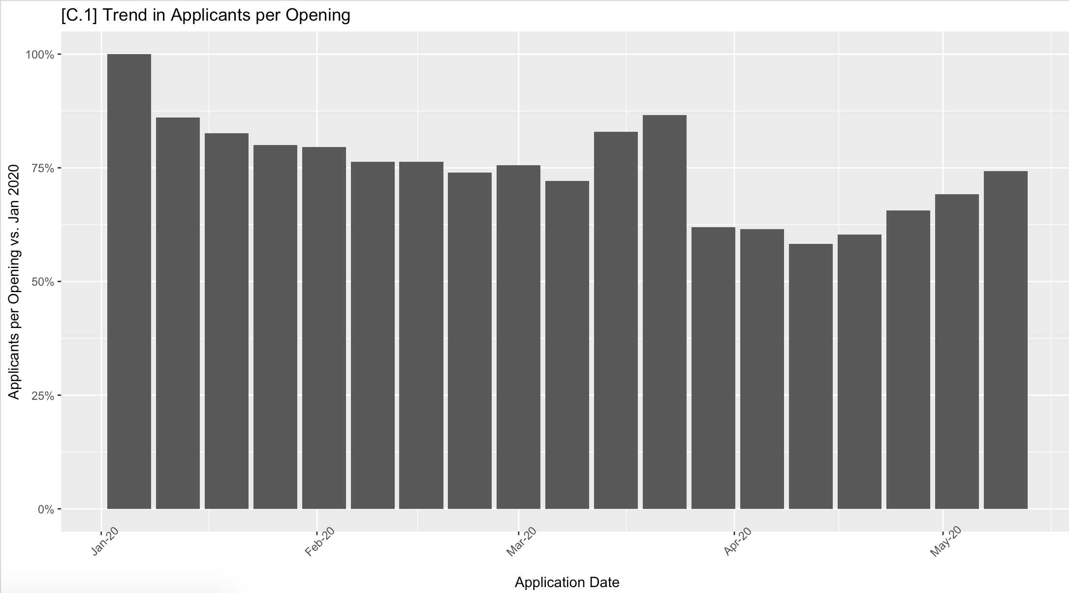
Job Applications: 2008 vs. Now
The next chart looks at the number of weekly applicants per open req. With unemployment spiking to levels not seen in close to a century, you might expect to see a sharp increase in the number of applicants, but the actual story is considerably more complicated. In fact, applicant volume has been on a steady slow decline for several quarters as the market continued to tighten. Below, we see a two-week spike in the second half of March that reversed quickly, followed by a more gradual increase recently. I’ll save the detailed breakdown of this for another post, but we’re not yet seeing a broad deluge of jobseekers for the openings that are out there.
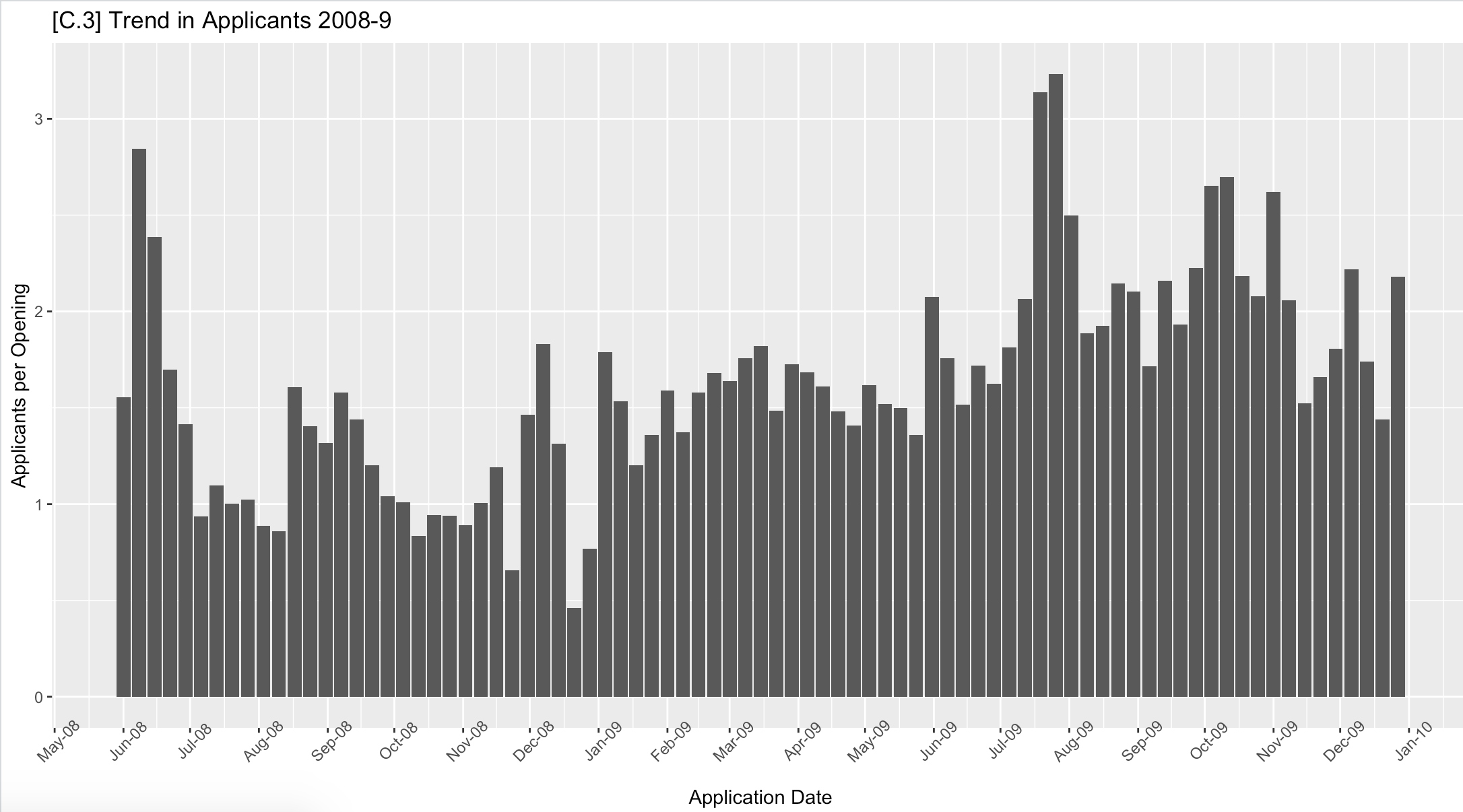
While none of us have a good parallel to this unique systemic shock, we can compare it to the 2008-9 crisis to get some context. Unlike many of our competitors, we started over 15 years ago and thus have real data from the last business cycle for comparison. Here’s a similar view of applicant volume per opening from mid-2008 through the end of 2009. For reference, the Lehman bankruptcy occurred in September of 2008 and the stock market bottomed out in March of 2009. Squint a little, and we see a flat-declining trend in the second half of 2008, followed by a slow and steady increase in 2009.
What Does It All Mean?
Our data confirms in stark detail just how quickly the world slammed on the brakes in early March. Likewise, while people are still working remotely in larger numbers than ever before, they’re also broadly returning to the work of hiring. While still well off its previous level, what we see now is less of a hiring freeze and more of a hiring focus emphasizing key roles.
Finally, companies that assume it will be easy to replace roles and headcount shed over the past 4-8 weeks may be in for a nasty surprise, especially if the recovery follows a path on the more optimistic side of the consensus.
What we don’t know is whether we’re truly past the peak of the pandemic, or simply approaching the end of the first chapter. Either way, what companies need in these circumstances above all else is agility in their planning and forecasting. The real winners will not be those who predict the future, but the ones who see the new “present” clearly and re-orient to it first.